Brand
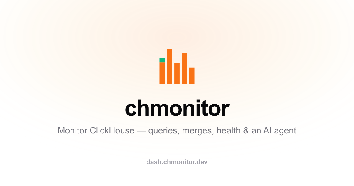
A flat metric-bar mark
with an emerald top-cap dot.
chmonitor's identity is five bars of varying height on ClickHouse's column grid — a monitor reading a cluster. The emerald cap on the left bar is the signal: healthy, live, watching.
The mark
One glyph, three finishes
Color for product surfaces, single-ink mono for documents, and the same mono reversed for dark backgrounds.
Lockup
Mark + wordmark
The wordmark is set lowercase in Inter SemiBold with tight tracking. Keep the mark roughly the cap-height of the word, with a gap of one bar's width.
Color
Four values, one signal
Orange carries the bars, emerald is reserved for the "healthy / live" signal — never decoration. Ink and paper handle everything mono.
Usage
Keep it honest
- Give the mark clear space of at least one bar-width on every side.
- Use the emerald cap only at its native position (top of the left bar).
- Prefer the SVG; fall back to the PNG / favicon where SVG isn't supported.
- On dark surfaces, use the reversed mono mark or the color mark as-is.
- Don't recolor the bars, add gradients, or restore the old tile / ping.
- Don't stretch, rotate, or reorder the bars — the heights are the identity.
- Don't pair the mark with the ClickHouse logo as if it were one brand.
- Don't set the wordmark in any face other than Inter.
Downloads
Grab the files
Everything is generated from one script (scripts/build-brand-assets.ts) so the kit never drifts from the mark.